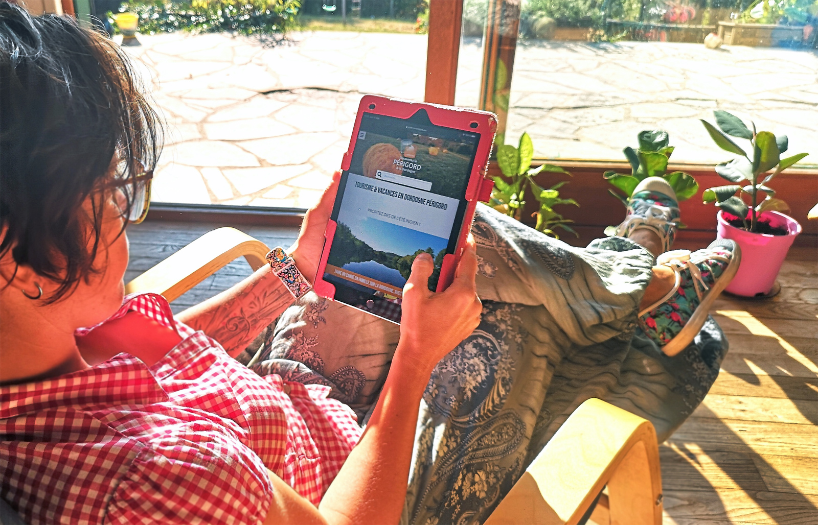
We are very proud to present you the new version of our Tourist Guides websites. After months of reflection, consultation and exchange with our clients, our sales team and our technical and graphic team, here are the new designs! So what’s new? Follow us for a detailed, but not exhaustive, overview of these improvements…
Always more ergonomics, for an incomparable visit experience
Our guides are consulted by more than 2 million unique users per year. We study the statistics closely and assiduously, and we note that Internet users are using an increasingly diverse range of devices to consult our sites. Smartphones of different resolutions, tablets, laptops, desktops … We want to offer the best experience to each of you, that’s why we do our best to make our sites attractive in all resolutions!
- Wider screens: screens are getting wider and wider, whether on smartphones, tablets and especially on desktops. We have therefore increased the width of our main reading area. Those who are surfing from a wide screen will really notice the difference, both on the homepage and on the cards or articles. It’s important to read and enjoy the pictures, to prepare your holiday, isn’t it?
- Speed of navigation and page loading: we have optimised the loading time of our pages by working on the display of the photos. Depending on the screen resolution of the user, the photos and images are resized just right! We have also worked on the numerous icons used on the site, to optimise their display, further speeding up the loading of the information sheets, while allowing an aesthetic transparency of these icons, on the background of our sites.
- Adjustment of the rules for loading content and data libraries: we have fine-tuned the parameters of the user cache. We only load the necessary content and not at each page refresh: the user keeps the information (style sheets, script, font, main menu, etc.) in his cache until the page has been modified by our webmaster. We also did this work on the different libraries called by our sites to load external content (Google, Youtube …)
More effective and targeted promotion of our customers
Our clients are the service providers of tourist activities that trust us by becoming partners of our Guides. Our aim? To promote them and offer their services and activities at strategic moments in the browsing process. This is why we have redesigned the pages and the integration of the banners:
- Banners: more subtle integration into the content and more strategic positioning, so that they are seen without disturbing navigation or reading. Improved banners on desktop and tablet formats and increased the size in general. We have already seen a 46% increase in the click-through rate! (Guide du Périgord July/August 2020 versus July/August 2019)
- Very important work on the meshing of our contents: To further reduce our bounce rate (which is already low), to better guide Internet users in their search for activities and service providers in each destination, to better promote customers in a targeted geographical area: for all these reasons, we have done very important work on the meshing of content.
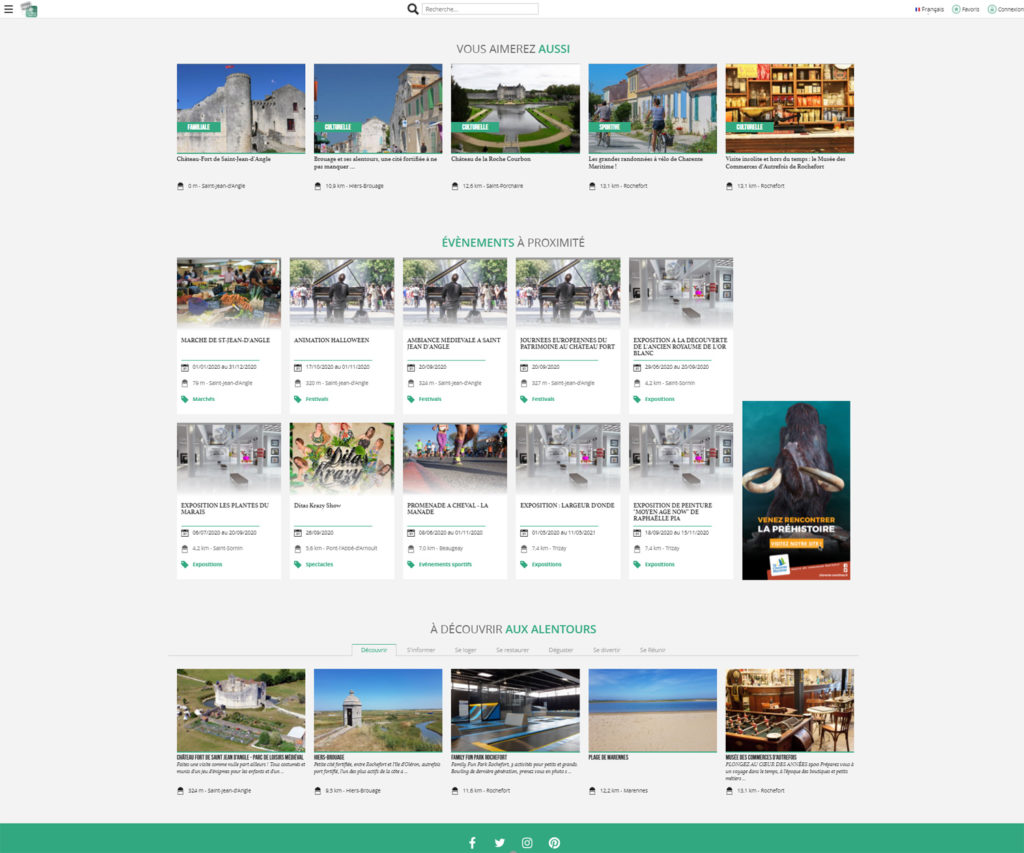
- Addition of related navigation suggestions on the AGENDA pages, which are highly consulted.
- Created a single page (with its own URL) for each event in the diary, which itself has suggestions for related articles and providers below.
- Highlighting advertisers as click-through suggestions, below our ARTICLES. »
A new design from top to bottom
Our graphics team has done a great job, in consultation with the technical and development team, to improve the overall look of our sites. A new look that complements all the technical improvements mentioned above:
- The pages are more airy and wide, we have worked in particular on the home page to make it more welcoming and ergonomic, more readable and relevant.
- All the fonts have been revised, the styles, the titles … On all the pages, the files, the articles…
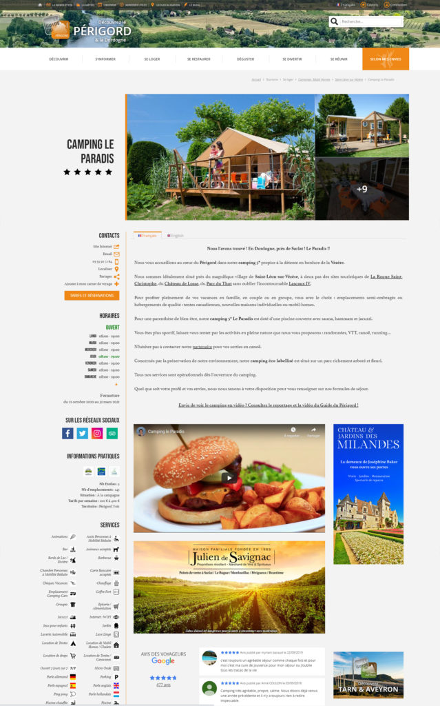
- The customer files have been completely redesigned: the positioning of the images, the location of the icons, the direct contact elements, the informative icons, the location of the videos (many customers wanted to add them to their file!).
- The articles have been optimised for reading: the page background is wider, the photos are of better quality and arranged with an “online magazine” look. Reading is easier and more pleasant!
We hope that all the changes will support the work we do in the field, to ensure that our clients are optimally promoted in all territories. Our Guides have seen a tremendous increase in traffic since June, is this due to these changes? Is it a result of the health context, which has benefited the tourism industry in France and in particular in the Grand Ouest? We are proud and happy to say that our clients have enjoyed fantastic visibility on our Guides this summer! And it’s not over yet!
